 Some
Wratten Photo Filters Some
Wratten Photo Filters
Ideal for the Viewer Box
|

|
|
First
check out the only region of all Wratten Filter curves below
that we're interested in, just the middle section, where the
human eye senses light and color. The above graph is a
simplified diagram of what we see: the light colored central
area. We don't sense light in the gray areas to each
side
(but CCD's and film can frequently sense parts of it, that's
why this data is usually shown).
|
|
|
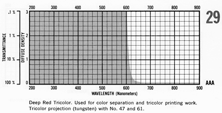
The deepest
red
filters generally available (here, a #29) allow light
right above 600 nanometers to pass through. This can
stimulate the green cones of the eye if the red light is set
high enough. We can do better than that. Look at the red
portion of any violet filter's curves, like the next
one:
|
|
|
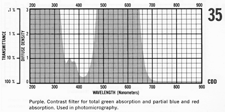
#35 is a very
deep
purple filter,
quite visibly intense (look through it!). It blocks all the
cyan through green, yellow and orange-red portions of the
spectrum, allowing only the blues and far reds through. The
red portion looks ideal for our viewer, but we have to
remove that blue region.
|
|
|
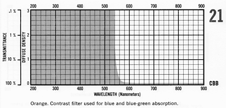
This orange
filter, #21, will do that job nicely. Many other
similar filters from deep yellow through light red will
serve as well. We're concerned that everything above 650 nm
or so gets through, but certainly not below 480 nm, where
the purple filter passes blue light.
|
|
|
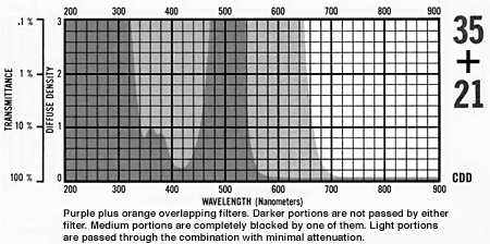
This overlap of the two
curves above shows us that a sandwich of the
purple
#35 with the orange
#21 does the job ideally well. We're left with only
the very far
red region above
650 nanometers, as one or the other filter blocks everything
below that. Inelegant, perhaps, but it works!
(I've
also just noticed that there is one reasonably adequate
single filter that can be used, a #92, and one that's almost
identical to our sandwich, #70. For some reason the #70 was
unavailable when I built the viewer, and my sandwich is
slightly better than #92 alone, besides being "irresistibly
clever..." :^)
|
|
|
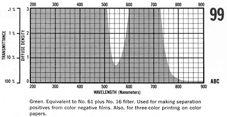
In keeping with the purity
of the deep red filter, here's an ideal deep
green filter for
the other light. #99 is a
near-monochromat
(don't worry about that right hand "infrared" region -- we
can't see there, remember?),
much less likely to trigger any of our eye's cones, except
the green ones. But we'll keep the light source down at a
level too dim for that, and we'll be in good shape.
(Note: the main problem with using broader filters is
that we risk triggering the blue and green cones -- narrower
filters like these permit somewhat higher light levels,
within these restrictions.)
©
2001-2007 Serendip LLC. No images, text, graphics or design
may be reproduced without permission. All Rights
Reserved.
|
|
Close
this window to return to the text.
|
